Get to Know Gatsby Building Blocks
In the previous section, you prepared your local development environment by installing the necessary software and creating your first Gatsby site using the “hello world” starter. Now, take a deeper dive into the code generated by that starter.
Using Gatsby starters
In tutorial part zero, you created a new site based on the “hello world” starter using the following command:
When creating a new Gatsby site, you can use the following command structure to create a new site based on any existing Gatsby starter:
If you omit a URL from the end, Gatsby will automatically generate a site for you based on the default starter. For this section of the tutorial, stick with the “Hello World” site you already created in tutorial part zero. You can learn more about modifying starters in the docs.
✋ Open up the code
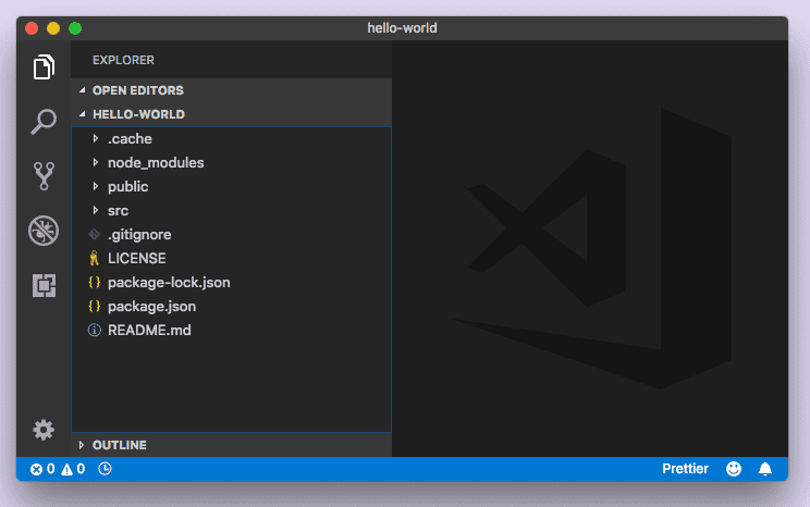
In your code editor, open up the code generated for your “Hello World” site and take a look at the different directories and files contained in the ‘hello-world’ directory. It should look something like this:
Note: Again, the editor shown here is Visual Studio Code. If you’re using a different editor, it will look a little different.
Let’s take a look at the code that powers the homepage.
💡 If you stopped your development server after running
gatsby developin the previous section, start it up again now — time to make some changes to the hello-world site!
Familiarizing with Gatsby pages
Open up the /src directory in your code editor. Inside is a single directory: /pages.
Open the file at src/pages/index.js. The code in this file creates a component that contains a single div and some text — appropriately, “Hello world!”
✋ Make changes to the “Hello World” homepage
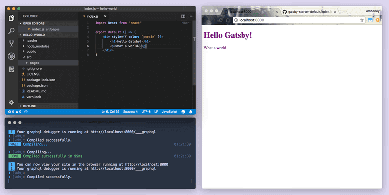
- Change the “Hello World!” text to “Hello Gatsby!” and save the file. If your windows are side-by-side, you can see that your code and content changes are reflected almost instantly in the browser after you save the file.
💡 Gatsby uses hot reloading to speed up your development process. Essentially, when you’re running a Gatsby development server, the Gatsby site files are being “watched” in the background — any time you save a file, your changes will be immediately reflected in the browser. You don’t need to hard refresh the page or restart the development server — your changes just appear.
- Now you can make your changes a little more visible. Try replacing the code in
src/pages/index.jswith the code below and save again. You’ll see changes to the text — the text color will be purple and the font size will be larger.
💡 We’ll be covering more about styling in Gatsby in part two of the tutorial.
- Remove the font size styling, change the “Hello Gatsby!” text to a level-one header, and add a paragraph beneath the header.
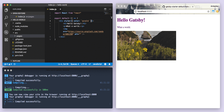
- Add an image. (In this case, a random image from Unsplash).
Wait… HTML in our JavaScript?
If you’re familiar with React and JSX, feel free to skip this section. If you haven’t worked with the React framework before, you may be wondering what HTML is doing in a JavaScript function. Or why we’re importing react on the first line but seemingly not using it anywhere. This hybrid “HTML-in-JS” is actually a syntax extension of JavaScript, for React, called JSX. You can follow along with this tutorial without prior experience with React, but if you’re curious, here’s a brief primer…
Consider the original contents of the src/pages/index.js file:
In pure JavaScript, it looks more like this:
Now you can spot the use of the 'react' import! But wait. You’re writing JSX, not pure HTML and JavaScript. How does the browser read that? The short answer: It doesn’t. Gatsby sites come with tooling already set up to convert your source code into something that browsers can interpret.
Building with components
The homepage you were just making edits to was created by defining a page component. What exactly is a “component”?
Broadly defined, a component is a building block for your site; It is a self-contained piece of code that describes a section of UI (user interface).
Gatsby is built on React. When we talk about using and defining components, we are really talking about React components — self-contained pieces of code (usually written with JSX) that can accept input and return React elements describing a section of UI.
One of the big mental shifts you make when starting to build with components (if you are already a developer) is that now your CSS, HTML, and JavaScript are tightly coupled and often living even within the same file.
While a seemingly simple change, this has profound implications for how you think about building websites.
Take the example of creating a custom button. In the past, you would create a CSS class (perhaps .primary-button) with your custom styles and then use it whenever you want to apply those styles. For example:
In the world of components, you instead create a PrimaryButton component with your button styles and use it throughout your site like:
Components become the base building blocks of your site. Instead of being limited to the building blocks the browser provides, e.g. <button />, you can easily create new building blocks that elegantly meet the needs of your projects.
✋ Using page components
Any React component defined in src/pages/*.js will automatically become a page. Let’s see this in action.
You already have a src/pages/index.js file that came with the “Hello World” starter. Let’s create an about page.
- Create a new file at
src/pages/about.js, copy the following code into the new file, and save.
- Navigate to
http://localhost:8000/about/
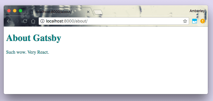
Just by putting a React component in the src/pages/about.js file, you now have a page accessible at /about.
✋ Using sub-components
Let’s say the homepage and the about page both got quite large and you were rewriting a lot of things. You can use sub-components to break the UI into reusable pieces. Both of your pages have <h1> headers — create a component that will describe a Header.
- Create a new directory at
src/componentsand a file within that directory calledheader.js. - Add the following code to the new
src/components/header.jsfile.
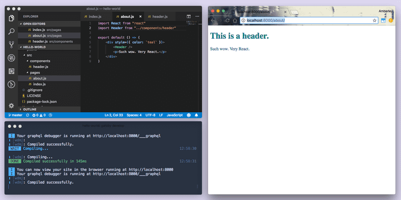
- Modify the
about.jsfile to import theHeadercomponent. Replace theh1markup with<Header />:
In the browser, the “About Gatsby” header text should now be replaced with “This is a header.” But you don’t want the “About” page to say “This is a header.” You want it to say, “About Gatsby”.
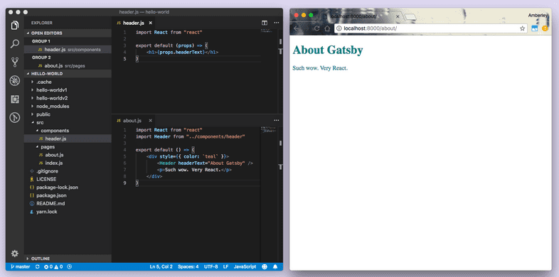
- Head back to
src/components/header.jsand make the following change:
- Head back to
src/pages/about.jsand make the following change:
You should now see your “About Gatsby” header text again!
What are “props”?
Earlier, you defined React components as reusable pieces of code describing a UI. To make these reusable pieces dynamic you need to be able to supply them with different data. You do that with input called “props”. Props are (appropriately enough) properties supplied to React components.
In about.js you passed a headerText prop with the value of "About Gatsby" to the imported Header sub-component:
Over in header.js, the header component expects to receive the headerText prop (because you’ve written it to expect that). So you can access it like so:
💡 In JSX, you can embed any JavaScript expression by wrapping it with
{}. This is how you can access theheaderTextproperty (or “prop!”) from the “props” object.
If you had passed another prop to your <Header /> component, like so…
…you would have been able to also access the arbitraryPhrase prop: {props.arbitraryPhrase}.
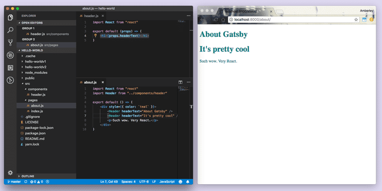
- To emphasize how this makes your components reusable, add an extra
<Header />component to the about page, add the following code to thesrc/pages/about.jsfile, and save.
And there you have it; A second header — without rewriting any code — by passing different data using props.
Using layout components
Layout components are for sections of a site that you want to share across multiple pages. For example, Gatsby sites will commonly have a layout component with a shared header and footer. Other common things to add to layouts include a sidebar and/or a navigation menu.
You’ll explore layout components in part three.
Linking between pages
You’ll often want to link between pages — Let’s look at routing in a Gatsby site.
✋ Using the <Link /> component
- Open the index page component (
src/pages/index.js), import the<Link />component from Gatsby, add a<Link />component above the header, and give it atoproperty with the value of"/contact/"for the pathname:
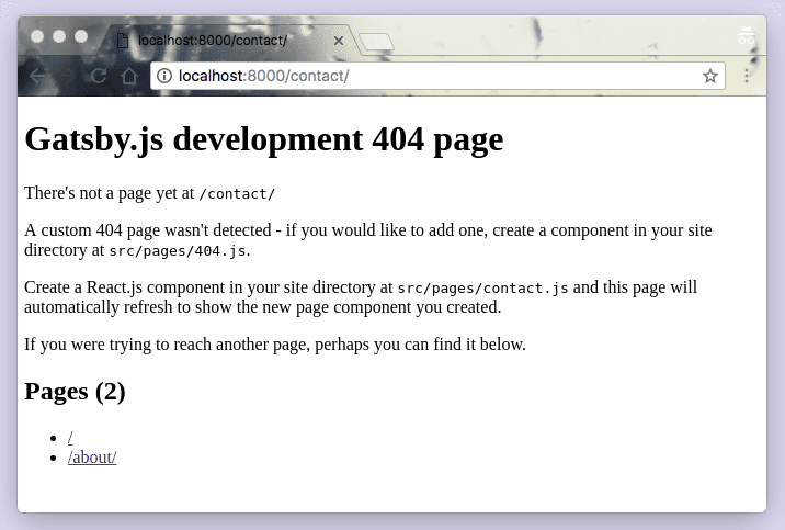
When you click the new “Contact” link on the homepage, you should see…
…the Gatsby development 404 page. Why? Because you’re attempting to link to a page that doesn’t exist yet.
- Now you’ll have to create a page component for your new “Contact” page at
src/pages/contact.jsand have it link back to the homepage:
After you save the file, you should see the contact page and be able to follow the link to the homepage.
The Gatsby <Link /> component is for linking between pages within your site. For external links to pages not handled by your Gatsby site, use the regular HTML <a> tag.
Deploying a Gatsby site
Gatsby is a modern site generator, which means there are no servers to set up or complicated databases to deploy. Instead, the Gatsby build command produces a directory of static HTML and JavaScript files which you can deploy to a static site hosting service.
Try using Surge for deploying your first Gatsby website. Surge is one of many “static site hosts” which makes it possible to deploy Gatsby sites.
Gatsby Cloud is another deployment option, built by the team behind Gatsby. In the next section, you’ll find instructions for deploying to Gatsby Cloud.
If you haven’t previously installed & set up Surge, open a new terminal window and install their command-line tool:
Next, build your site by running the following command in the terminal at the root of your site (tip: make sure you’re running this command at the root of your site, in this case in the hello-world folder, which you can do by opening a new tab in the same window you used to run gatsby develop):
The build should take 15-30 seconds. Once the build is finished, it’s interesting to take a look at the files that the gatsby build command just prepared to deploy.
Take a look at a list of the generated files by typing in the following terminal command into the root of your site, which will let you look at the public directory:
Then finally deploy your site by publishing the generated files to surge.sh. For newly-created surge account, you need to verify your email with surge before publishing your site (check your inbox first and verify your email).
Note that you will have to press the
enterkey after you see thedomain: some-name.surge.shinformation on your command-line interface.
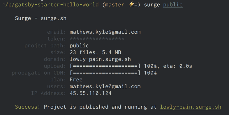
Once this finishes running, you should see in your terminal something like:
Open the web address listed on the bottom line (lowly-pain.surge.sh in this
case) and you’ll see your newly published site! Great work!
Alternative: Deploying to Gatsby Cloud
Gatsby Cloud is a platform built specifically for Gatsby sites, with features like real-time previews, fast builds, and integrations with dozens of other tools. It’s the best place to build and deploy sites built with Gatsby, and you can use Gatsby Cloud free for personal projects.
To deploy your site to Gatsby Cloud, create an account on GitHub if you don’t have one. GitHub allows you to host and collaborate on code projects using Git for version control.
Create a new repository on GitHub. Since you’re importing your existing project, you’ll want a completely empty one, so don’t initialize it with README or .gitignore files.
You can tell Git where the remote (i.e. not on your computer) repository is like this:
When you created a new Gatsby project with a starter, it automatically made an initial git commit, or a set of changes. Now, you can push your changes to the new remote location:
Now you’re ready to link this GitHub repository right to Gatsby Cloud! Check out the reference guide on Deploying to Gatsby Cloud.
➡️ What’s Next?
In this section you:
- Learned about Gatsby starters, and how to use them to create new projects
- Learned about JSX syntax
- Learned about components
- Learned about Gatsby page components and sub-components
- Learned about React “props” and reusing React components
Now, move on to adding styles to your site!
